css 小知识(margin, padding)
Feb 22, 2017
关于 CSS 的 margin 和 padding 属性,有一个比较有意思的小知识,不详细看 w3c 的说明并不会发现。
🌰栗子
1 |
|
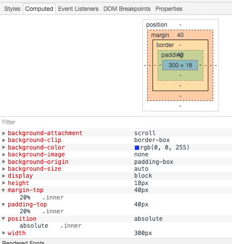
上面可以看到,margin-top 和 padding-top 都是 40px,这 40px 怎么来的呢?
w3c 的官网上有详细的说明,具体有一个描述是这样的:
The percentage is calculated with respect to the width of the generated box’s containing block, even for ‘padding-top’ and ‘padding-bottom’. If the containing block’s width depends on this element, then the resulting layout is undefined in CSS 2.1.
意思是当 margin padding 被设置为百分比 的时候,这个数值的计算是基于他的包含块(containing block)的宽度来计算的。那什么是包含快呢?
包含快(containing block)
包含块 ≠ 父元素 ,以上面的栗子来说明,.inner 的 父元素 是 .mid ,它的宽度是 100px ,如果 包含块 是 父元素 的话,计算结果应该是 20px ,所以 包含块 ≠ 父元素 。事实 40px 是基于 .outer 计算出来的, 200px * 20% = 40px ,为什么呢?
因为,如果元素具有 position:absolute ,包含块 则是离最近的 position 为 absolute,relative 或者 fixed 的 块级祖先元素。